Back in January, I did a little bit of renovating in the open, during which I stripped things back and changed a bunch of things around over a period of a few weeks.
This week, I’ve made some more changes. Consider it a continuation of that work, or don’t, but some people really hate change, so I feel inclined to defend changing anything.
Lost in space
For the first time in a very long time, this site is no longer typeset in Space Grotesk, having replaced it with GitHub’s Hubot Sans.
This isn’t so much that I prefer Hubot Sans, but that I’ve been increasingly frustrated by Space Grotesk’s limitations, particularly around how it renders italic text.
For the typographic normies reading this, not all italics (or ‘obliques’) are made equally. When a typeface has specifically designed italics, we call that ‘true’ italics. When those are missing, browsers and image editing software will try to create italics by skewing the default letterforms, creating ‘faux’ italics.
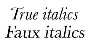
True italics are pretty much always preferable to faux italics, because true italics are specifically designed for that purpose. Faux italics can often look a little out of place, because they were never intended to exist.
Space Grotesk has never had true italics, and when it comes to writing prose, like blog posts, the lack of true italics is very annoying to me in particular.
Hubot Sans has true italics. It also has more variations of weight and width than Space Grotesk, which I’ve made some use of in the new design. Some headings are wider than their surrounding text and some are narrower. It’s a neat effect that I’d like to play with more.
Good vibrations
Colours across the board have been updated. It’s still the purple and green of the last couple of redesigns, but the exact colours have been changed.
This is most notable in the dark theme’s purple, which is significantly more vibrant and now meets the minimum ratio for accessible non-text contrast, expanding how it can be used.
The light theme also now uses a light grey background rather than pure white, so hopefully it’s a little less blinding.
Not so square, now
The dynamically generated squares that appeared on the homepage and OpenGraph images, and in animated form on the 404 page, have been removed.
It was neat, but it was also a little buggy and involved loading a whole bunch of JavaScript just to add some background texture.
This one’s really just a sacrifice on the altar of performance and tidy code.
And the other stuff
The homepage has been lightly redesigned. I ended up removing two of the amazing Ash images by TuxedoDragon in the process, but I want to add them back somewhere soon!
Blog posts and generic content pages have had their layouts reversed so that the primary content is on the left and supplemental information is on the right. These pages now use CSS grids for layout as well, somewhat deviating from one of my old rules about how I build the site, but y’know, times change, and also…
Templates and pages can now have their own CSS bundles, so doing this kind of only-in-one-place layout coding is simple and still very performant. Thanks Eleventy bundles.
There’s a mega pull request with all of these changes included, plus some others, if you’re interested in looking at the code.
Coming soon?
I’ve wanted to rewrite and redesign the about section for quite a while now. I’ll probably prioritise doing that next.
I’ve also been thinking about adding some new sections, such as a ‘stash’ of interesting links or a repository of handy code snippets. I’m a little worried about the amount of upkeep involved in keeping them relevant, so I’m probably going to sit on those ideas until I feel more sure of them.