Alt text! Alternate text. Text that is an alternative to something else.
Alternate text is text that describes an image, in case the image cannot be consumed in the conventional manner one would consume an image.
But you probably knew all that. All decent websites and social apps will let you write some alternate text whenever you upload an image.
This is a post about why you should write alt text and how to do a decent job of it.
Why write alt text?
Alt text makes images understandable. That’s it. That’s the reason.
Notice I didn’t say “understandable to blind people.” Although alt text is an essential tool in the belt of online accessibility (and frankly, that should be reason enough), alt text is useful for so much more.
Slow or patchy internet connection? Alt text helps those users quickly gain context, even if the image cannot load properly.
Partially archived webpage with missing images? Alt text helps describe what used to be there, even though it isn’t there anymore.
Want search engines to know what’s in the image? Alt text is a key indicator to search engines of what an image contains, improving search engine rankings.
Image just messy, confusing or difficult to understand? Alt text can help guide a user to what they should be looking for.
There are probably even more, but the point is that alt text benefits others and it benefits you. Use it.
But, but… can’t optical machine AI learning image recognition do that for me?

No.
Bad.
Stop that.
Optical image recognition is good for two things: transcribing text, and having a vaguely confident guess that the round fuzzy thing in that picture is either a cat or a pillow. (Answer: It’s a sea cucumber.)
Moreover, they lack one of the most important parts of any alt text: context. A machine learning algorithm might be able to guess what is in the image, but it sure as hell can’t tell you why it’s in the image.
That may sound like a weird distinction, but this is why arguments that alt text should be fixed metadata that’s embedded within images, rather than provided manually when posted, don’t hold water. Fixed metadata cannot provide context.
Alternate text tips
A picture may say a thousand words, but you don’t need to write a thousand words to write good alt text.
1. Provide context
Uploading a painting of a beautiful nebula? Describe the shape and colours of the nebula.
Posted a photo of a person in a busy crowd cosplaying as the personification of Spirk? Describe Spirk, not the people around them.
Found a funny meme cat pic? Explain what it is about the cat that looks funny!

If this were being posted as a reaction image, the alt text might be something like this:
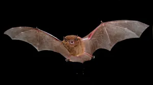
Photograph of a bat in flight. It’s facing towards the camera with its beady eyes and mouth agape, as though it’s been shocked by the viewer.
Whereas if the image were being posted as part of, say, a bot that posts a lot of bat photographs, the alt text would be more descriptive of the bat itself:
A forward view of a fluffy, reddish-brown bat in flight against a black backdrop. It has a small, rounded body. Its brown wings are stretched wide, and it’s arms and legs appearing a more reddish colour. It has small, brown pointed ears and small, beady black eyes. Its mouth is open, exposing several white, pointed teeth. A small amount of liquid appears to be dripping from it.
You, and only you, know why you’re posting the image. Only you know what part of the image is important and that people should be paying attention to. Use your alt text to help describe why you posted the image, not just what’s in it.
2. But don’t repeat yourself
Text content is the foundation of the web, and images online are almost always posted alongside text content.
Alt text does not need to repeat nearby text content. It’s redundant and just serves as an annoying barrier to the meat of the alternate text.
In the previous examples, the specific species of bat isn’t included in the alt text because that information is already in the body of the post, so repeating it is unnecessary.
3. Avoid too much detail
Try to stick to only what is needed to understand the image. This will usually only be one or two things, and those things are what you should spend most of your words describing.

If this were being shared in the context of it being an advert—maybe it’s from Microsoft’s Twitter account—then the alt text might read like this:
Two colleagues working together at a table; they’re both smiling while looking at the same Microsoft Surface device.
Notice that this example doesn’t make any effort to describe the physical appearance of the people or their setting.
The goal is to portray successful collaboration between people thanks to the use of a Microsoft product, so that’s what the bulk of the alt text is about. Describing the appearance or implied features of the people photographed, the speckled design of the table, or the hanging plant behind them would all be superfluous and distracting from the main context of the image.
4. Include any text within the image
If the image contains text content, you should transcribe this text within in the alt text.
As per the first tip, only transcribe the text that is relevant to understanding the context. If you’re posting the front page of a newspaper with a funny headline, for example, you only need to transcribe the headline and not any body copy, captions, or bylines.
As per the second, if any of the text in the image is duplicated in nearby text content, you can also likely omit it.
If the text is in a speech bubble, on a sign, or in some other medium other than ‘just text’, you may want to include that detail.

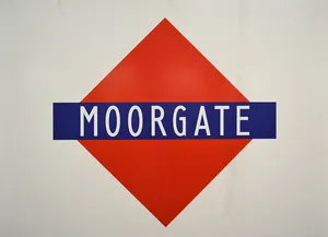
The non-standard Underground roundel at Moorgate. A red diamond and with a dark blue rectangle crossing horizontally through its middle. The word ‘Moorgate’ is written in white, narrow lettering inside of the rectangle.
5. Describe the type and style of image, if it’s useful
You don’t need to say that the image is an image; that much is usually obvious. However, it can be useful to describe what kind of image it is. A photograph? An illustration? A painting? Is it a pencil sketch? A Medieval manuscript? Watercolour? A grainy Polaroid? Is it of the Art Nouveau style?
All of these details can help a user better understand what they’re looking (or not looking) at.

Some possible alt text for this image:
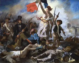
‘Liberty Leading the People’ by Eugène Delacroix. An 19th-century Romantic oil painting about the French Revolution. It depicts a woman wearing a Phrygian cap, holding a rifle and raising the French flag above a field of fallen soldiers, accompanied by people of all ages and classes wielding guns and swords.
In this example, describing the era, style, and medium of the painting can help a user visualise its appearance, even if they can’t actually see it right now.
6. Consider splitting up sequences
Imagine a book where you couldn’t pause in the middle of reading it, couldn’t flip back a page to re-read something, and couldn’t flip through to look something up. A book where you’re forced to read it word-for-word from the start, every single time you want to read any of it.
That would suck, right?
I would recommend splitting sequences, such as comic book pages, into individual panels. Being able to provide alt text for one panel at a time is usually easier for the person writing it, and provides for a less overwhelming experience for assistive technology users who have to interact with it.
If this isn’t practical or possible, or if there’s some aspect of the layout or composition that is important to the context, then consider doing a panel-by-panel breakdown within the alt text instead.

Alt text for this strip could be written like this:
An issue of the newspaper comic strip ‘Garfield’, with three panels.
Panel 1: Jon Arbuckle, a human man, sits in an armchair, reading a newspaper held in one hand whilst the other hand fumbles against a side table.
Panel 2: Jon lowers his newspaper and looks towards the viewer. A thought bubble reads: ‘Now where could my pipe be?’
Panel 3: Cut to Garfield, an overweight orange and black cat, who is sitting on the floor contentedly smoking a wooden pipe. A speech bubble from outside of the panel exclaims, ‘Garfield!’
Not all applications will allow you to use new lines like this. In those cases, just write a run-on paragraph. It’s better than nothing.
In the spirit of not repeating yourself, if there are any recurring elements within a sequence—such as people, settings or items—you probably only need to describe these on their first appearance.
7. Use a thousand words if you have to, but try not to
There has traditionally been some old ‘best practice’ that alt text should be quite short, usually only 120 characters. This was supposedly based on screen readers not reading any alt text longer than 125 characters.
At least as of today, this isn’t the case, and alt text can be as long as it needs to be to get the point across.
That isn’t permission to ramble, however. Focus your efforts on what’s needed to understand the image and its context.
The exceptions
There are a couple of situations where alt text can be left out.
The first is when the entire equivalent to alt text is given context through nearby text, in such a way that adding alt text would just repeat information without providing additional context.

The examples in this post fall under this category.
Each one has “alt text” following them as part of normal content, so the images themselves don’t have alt text.
The other is when an image is purely decorative; that is, giving a description wouldn’t provide any further context and is more likely to be annoying or disruptive.
On a traditional website, this might be an image that exists for a purely aesthetic reason, like a border or background. On social media, this could be one of those images that are added to make a post larger and more visually interesting, without adding any real value.
In both of these cases, the alt attribute should be present but left empty, to make it clear that the absence of alt text is intentional.
And a little disclaimer
This post is primarily aimed at people who are uploading “contentful” images to social media services.
There are some additional nuances when it comes to how alt text is used on websites, such as for marking up logos and iconography, which aren’t touched upon here. And don’t get me started on video or audio content; that’s a whole other kettle of fish.
Maybe in a future blog post…