This website’s been a flurry of activity lately, but unlike the last Changelog the changes have been largely invisible to the average user.
Still, what happens behind the scenes is almost as important as what happens on the stage, so it’s still worth talking about. It’s about the process.
New content!
I’m starting with content just because that’s quick and easy.
I’ve added a now page that provides a brief overview of just what I’m up to. This isn’t a new idea (it’s nearly nine years old, in fact), but it’s a handy tool for anyone who doesn’t follow any of my (increasingly few) social media presences.
The homepage footer lists webrings now! I’ve wanted to add webrings to this site for a long time as part of my lamentations about websites not having links anymore, but I never quite figured how to do it without cluttering up the footer of every page. The solution? Just put them on the homepage, stupid.
GOV.UK browser data, which I previously only posted on Mastodon, now has a much more comprehensive home here too.
Eleventy 3!
The third major release of Eleventy, the static-site generator that this site is built on, came out just yesterday.
Inconveniently (or maybe conveniently?), it did so the day after I had upgraded everything to the canary release of Eleventy 3. As Eleventy 3 added native support for ESM (short for ECMAScript Modules, somehow), I took the time to convert everything from CommonJS to ESM-style JavaScript in the process.
What’s the benefit of doing that? Heck if I know, but ESM seems to be the direction that the JavaScript ecosystem has been moving towards in recent years, and I suppose it does seem a little bit neater.
Here’s the Eleventy 3 upgrade’s pull request if you want to see a lot of slightly rewritten JavaScript.
With Eleventy 3 comes some other useful features, such as being able to use virtual templates and the Eleventy 3 RSS plugin to massively simplify my dodgy RSS feed generation.
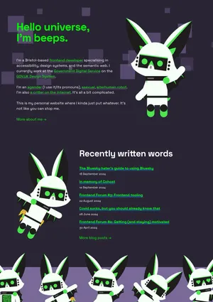
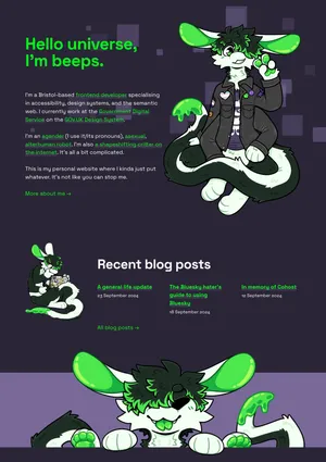
Artwork overhaul!
It was over a year ago now that I wrote about the change of my primary fursona from a robot bat to a wiggly alien noodle shapeshifter thing, and the site finally got updated to reflect that.
The homepage, footer, 404 page and social sharing images have all been updated with new, bespoke artwork commissioned from the very awesome TuxedoDragon.
All of it’s so good! And full of a bunch of little Easter eggs and references too!
I had some real paw-wringing moments over how big I could make them before having to worry about loading times.
The blog post list and footer both got little redesigns at the same time, the latter complete with a little paw bouncing animation. It’s totally unnecessary, but I love it.

At the same time, the collection of character callout headshots was expanded with some new variants commissioned from Caius Nocturne.
All of that work is included in the ‘Retire Emy’ pull request.
Forced colour fixes!
Those who know me know that I care about online accessibility more than the average person. After all, what kind of world would create an infinite pool of knowledge and interconnection and then lock people out of it for having bad eyesight or poor motor control?
A shitty world, is the answer.
I always try to build this website according to the best practices I’ve learned through my work, research and training, but I’m also not a corporation, and I don’t have the resources for any of the stuff I build to be externally audited. In short, stuff slips by me sometimes.
And more recently that stuff has been forced colour modes. Forced colour modes are… modes that forcibly recolour parts of websites.

Forced colour mode may sometimes be called “high contrast mode”, but this is really a misnomer.
Although commonly used to enforce higher contrast colour combinations, forced colour modes are also used to create less contrasting combinations, as too much contrast can cause eye strain and migraines in some people.
I’d never actually tested this website in a forced colour mode before, and I found quite a few issues upon doing so.

In Chromium browsers, you can emulate forced colours by going opening dev tools and clicking the ‘⋮’ (three dots) menu, then navigating to ‘More tools’ → ‘Rendering’ → and scrolling down to ‘Emulate CSS media feature forced-colors’.
If you’re on Windows 10 or 11, you can activate forced colour modes under the ‘Ease of Access’ settings
macOS’s colour modes work differently and don’t ‘bubble’ down to to webpages. As far as I’m aware, using Chromium is the only way to test forced colours on macOS, but I’m very open to being wrong about this.
The forced-color-adjust CSS property and system colour keywords are your friends here.
The forced-colors media query allows you to make more specific customisations if forced colours are being used. For example, I use it to turn off the ‘spotty’ homepage background.
Here’s all the forced colour fixes for your perusal.
I haven’t quite squashed all of the accessibility bugs I found just yet, but I’m working on it!
The one that got away
There was one bug reported to me this month by Tobi (hi!) that links become difficult to read when they’re highlighted. Not a world-ending issue by any means, but I know some people like to highlight what they’re currently reading to help them keep track of where they are on a page, so it’s worth a look.
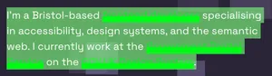
It turns out that my usually semi-sorta-transparent ‘thicc’ underlines are forcibly recoloured when text is highlighted. That should be an easy fix, right? It says right on the MDN page for ::selection that you can recolour text-decoration (which includes underlines) when text is selected. Should be easy-peasy!
It’s neither easy nor peasy.
Despite being part of the relevant CSS specification since at least 2015, no browser engine has actually implemented the ability to alter anything except for the color and background-color when text has been selected.
Actually, that’s a lie. You can also set text-decoration: none to remove the highlight effect entirely. 🤦
Here’s the open bugs reports for it for Firefox and Safari if you want to gently harass them to get on with it. Chromium had one open, which was closed as irreproducible, which obviously shows they didn’t even try.
Not sure what I’m gonna do with that other than potentially re-implement it some other way (back to box-shadow?), but it’d sure be nice if browsers just met the spec on this one.