It’s only been about six weeks since the last Changelog, but there’s been no shortage of changes going on behind the scenes. If anything it’s probably been the periods of greatest upheaval this site has had for a long time, and it’s probably not even been that obvious.
There’s a lot to discuss, so I’m probably going to keep things relatively short. There’ll be links to stuff where appropriate.
Changing up the git strategy
The first change to the website isn’t on the website at all, but in how its version controlled.
For most (maybe all) of the site’s existence, there has been a main branch. That branch gets updated. That branch gets deployed. Simple as.
I’d sometimes make separate branches for larger or more speculative pieces of work, but these would ultimately get either merged into the main branch locally or left to rot on remote.
Given I’m trying to more actively write about this site’s development, I figured I should switch to utilising pull requests more prominently. Pretty much everything coming up in this post will have gone through a more formal issue to pull request to merge route than has happened in the past.
I still commit directly to main for smaller stuff, but for big changes, I try and do pull requests instead.
The footer got a new layout
The footer on this site has been a skinny little thing for quite some time. As of late, there have been more and more links getting shoved down there, and tiny text for a crunched-up list of links is—in the words of Sonic the Hedgehog—no good.
The final straw was finally deciding on a license for the things I write. I wanted this to go into the footer, so it provided ample excuse to rejig the layout and make everything a bit bigger. Footer PR for the curious.


This also gave me space to bring back the “Keep circulating the HTML” message that previous versions of this site had.
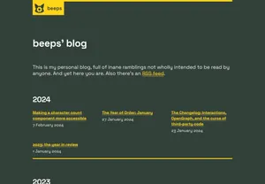
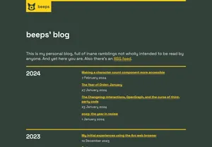
The blog archive and about pages also got new layouts
In mid-December, the blog archive page got reworked from being a straight list of posts to using a grid-like layout, where posts were organised into both rows and columns. The page felt like it was getting too long, and without anything like imagery to break it up, it was also fairly difficult to parse as anything but a massive, daunting list.
In February, I ultimately decided that I wasn’t keen on this. It just made the archive harder to scan through and made the negative space between posts more uneven due to the differing lengths of blog post titles.
I switched back to a linear layout but made the yearly separations more prominent—giving over the first third of the column to just the year heading, on wider screens—which makes it at least a little less daunting.
The redesign also let me dump some deadweight CSS. Score.
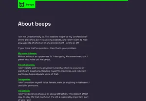
I had similar complaints with the about page, the landing page for which was a simple list of links and paragraphs. This was also changed to use a grid layout, and unlike the archive, I think it does work better as a grid.
Interestingly, doing this didn’t require any CSS changes, such is the power of my existing CSS objects and utilities.

Huh, wait… what’s with the different colours in those screenshots?
Dark mode got re-coloured
For some strange reason, it had never struck me as weird that the site’s light mode was purple & green and the dark mode was yellow & orange. I can’t even remember why I made it like that. After all, earlier versions of the dark mode were purple and pink.
For the sake of some semblance of brand consistency, I opted to change the dark mode to also use some variety of purple and green. This is just one part of some rather sweeping redesign work I plan on doing, but the rest won’t happen until later this year.

There’s a hearty dark mode pull request for the curious.
Soon after this, I updated the code block styles to adopt the new dark mode palette too. This previously used a palette based on Nova’s Neon theme, but I opted to change it up whilst I was concentrating on colours anyway.
It wasn’t a dramatic change, but what’s potentially interesting is how the new colours were created: all of them have a consistent saturation and lightness, but the hue is rotated through the use of hsl() and CSS custom properties.
It’s a technique I’ve known about for some time, but this is the first time I’ve actually used it for anything. It’s neat! Give the code a glimpse if you’re interested.
The use of CSS custom properties potentially ended up being a little prophetic… more on that later.
Markdown processing took on more responsibility
Another behind-the-scenes bit of work. Previously, I would wrap prosaic pieces (like, say, blog posts) in a dedicated prose class that would apply particular styles to paragraphs, headings, images, and the like.
This is not a new trick, in fact, it’s a very old one, but it’s also frustrating:
- You end up with more chained selectors.
- CSS specificity gets messy because styles in a prose block have a higher specificity than anything else.
- You end up needing to write more complex selectors to overrule the ones inside of prose blocks.
- There are times when you do want to use a class directly, rather than the assumptions made by the prose class, so you need to compensate for those.
- Components embedded within prose can get royally messed up.
I got frustrated enough at this state of affairs that I decided to try and sack off the prose class entirely by modifying my Markdown processor to add classes directly to the appropriate elements, no prose wrapper required.
I didn’t succeed at removing it entirely. Lots of older blog posts here are written in HTML rather than Markdown. Likewise, some other generated content, like the comments imported from the Fediverse, are provided as HTML in the API, not Markdown.
Still, new blog posts have no need for the prose class, so I can rest (relatively) easy.
The CSS got overhauled too
Title.
The structure of the website’s CSS (or rather, Sass) had been unaltered for quite a long time. In that time, CSS has evolved massively. Features that were once dependent on a compilation step or JavaScript polyfills are now supported in all mainstream browsers.
So I stripped all my CSS out and kinda-sorta redid it.
I went in with a few goals:
- Re-evaluate the approach to responsive design.
- Introduce container queries wherever they might make sense.
- Replace as many variables as possible with CSS custom properties.
- Replace as many Sass colour functions as possible with
color-mixand other new CSS colour functions.
My goal wasn’t to redesign the website, just to sift through the code with a fine comb and find out what could be tweaked or improved. This ended up being a huge chunk of work, so I’m gonna try and break it down a bit. But first, the visual diff:


The size difference? Uh, yeah, I’ll get to that.
The refactoring CSS pull request is hella chunky, but might make for good toilet reading.
Responsiveness and container queries
The old CSS was responsive. It scaled to fit the available screen space. There’s no denying that.
But it was responsive in a very rigid way. It had one set of font sizes for mobile and another for desktop. It had one set of spacing classes for mobile and another for desktop. If you resized your browser window, you could quite clearly see the point where things snapped from one to the other.
I did some stuff for desktop-plus screens, where the page would begin fluidly scaling up in response to more space being available, but otherwise, it was two clearly distinct layouts.
As frontend developers, we constantly remind ourselves that a mobile layout isn’t necessarily only for mobiles and a desktop layout isn’t necessarily only for desktops. A ‘mobile’ layout could be a person on a laptop with poor vision who has to zoom in a lot. A ‘desktop’ layout could actually be on a tablet with a touchscreen.
Having this dichotomy baked into code is kind of naff. Given I’m leaning heavily into using very new CSS features anyway, I figured it’d be a good time to switch to a fluid responsive layout.
Fluid responsive layouts use CSS features like custom properties, viewport units and clamp() to have things scale… fluidly. There is no ‘snap’. Stuff just gets proportionally larger or smaller according to the available space and the minimum and maximum constraints.
This kinda stuff involves a lot of maths, and I am bad at maths, so for this I reached for Utopia, a generator for such fluid systems. Utopia’s been around for quite a few years now, but it never felt like quite the right time to dive into it.
I’ve tried to keep most things in roughly the same ballpark as they used to be, but there has been a general ‘bulking up’ of both font sizes and margins. The new fluid scale also means that things are simultaneously larger than they used to be on smaller screens and smaller on larger screens. C’est la vie.
This same desire to avoid ‘snaps’ at obvious breakpoints also pushed me to use container queries for the very first time. (They’re delightfully simple!) They’re used fairly minimally at the moment, but I’m looking forward to thinking of more ways to put them to work.
Custom properties and colour functions
One of the big things that kept me using Sass’s variables over custom properties was the availability of colour functions.
This site runs on a very spartan colour palette, with only a few colours explicitly defined in code. All the other colours are generated by remixing those few.
Up until quite recently, doing that was something exclusive to pre-processors like Sass, but no more. As of mid-2023, every modern browser supports the color-mix function, which allows for the wanton combination of CSS colours in various colour spaces.
This wasn’t the only thing I was using Sass’s colour tools for, but it was the main thing, and I can live without the others.
color-mix being native also gave it a serious leg-up on Sass. Sass doesn’t (yet) support newer CSS colour spaces, but color-mix does, and I’ve been using them a lot more lately to make more vibrant yellows and more neon greens.
With my main barrier to using custom properties seemingly defeated, and the comparative simplicity of Utopia’s fluid responsive code, I quickly switched most things over. There’s still some Sass hanging around—mostly for media queries and generating utility classes—but the total amount of Sass-specific code has fallen dramatically.
Logical properties (wait what?)
Just over a year ago I railed against using CSS logical properties and values in production and how I’d stripped them from my site.
Today, they are back.
Have all of my issues been addressed since then? No.
Does this English-language-only website benefit from having them? Not really.
The main difference is that in the last year, native browser support for logical properties has gotten much better. Whereas back then you’d need to use a PostCSS plugin to get widespread support for the majority (but not all) properties, today, every mainstream browser supports all of them natively.
I still have the PostCSS plugin in my build just in case, but I can’t recall the last time I actually saw something that needed to be transformed.
The discussion over how shorthand properties should be handled is still unresolved, and I still find myself tripping over the whole border-end-start-radius order thing, but other than that, I think the tipping point has been reached. The pros outweigh the cons and logical properties are worth using again—at least on my little corner of the web where browser compatibility isn’t a barrier to revenue.
Wrap up
And this was only the big stuff. I added a new fursona reference sheet page, more pages now display a table of contents, :visited link style was added, images can now be links and have their own focus style, amongst all sorts of other little tweaks and changes.
I even inadvertently ended up making an image diff-slider thing just for this blog post. Oops.
It also uses some neat modern CSS features to work, specifically, using input[type="range"] to set a custom property in CSS, which is used by a clip-path to only show part of the overlapping image.
The basic concept is cribbed from this image compare web component but re-implemented on my own terms because I quite like writing my own code for things. Shocking for a developer, I know.
I’m still working away at bits and bobs. I want to ensure that all of these recent changes are as accessible as they can be, and I’m still tuning bits of the Utopia calculations to avoid potential weird outliers. Such is the perpetual work in progress.