Two days ago I was idly browsing my iTunes film collection (okay, not so idly, I was watching Star Trek IV: The One With The Whales for the sixth time) when I was reminded of a particularly frustrating aspect of the iTunes Star Trek films:
Why is these so little actual consistency here aaaugghhhh
Everything is a mess and I hate it.
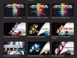
Films one through four all have these illustrated icons of a principal ship from each film, backed by the same rainbow motif found on the iconic The Motion Picture poster and consistent title style and placement. They look great, and really connects these films as all belonging to the same canon. Star Trek’s two through five make up an almost completely continuous story—with The Wrath of Khan leading directly into The Search for Spock and in-universe gaps of only a few months between The Search for Spock, The Voyage Home, and The Final Frontier.
Such a shame then that The Final Frontier is dumped with a thumbnail totally unrelated to the films that came before it. Gone is the constrained design and pleasant illustrations, replaced with a large, metallic delta shield covering half of the thumbnail, photographic headshots of Kirk, Spock and McCoy, and a minuscule rendering of the USS Enterprise-A. The film’s title is crammed into the delta. Why?!
The sixth film in the series—and the last to feature much of the original cast—The Undiscovered Country, is even worse. Starfleet’s delta shield has been massacred horribly, now stretched across two-thirds of the thumbnail and barely resembling its original shape. Presumably, they did this to fit The Undiscovered Country’s longer name, but even then, the entire Star Trek logo has been arbitrarily made larger, which is certainly not helping. The three OG main character headshots remain, alongside a larger (but still quite small) depiction of the Excelsior-class USS Enterprise-B.
The baton-fumbling Generations takes another departure again. The delta (still metallic and now much more three-dimensional thanks to liberal use of Photoshop’s emboss filter) plays background to… stills from the film. Yup. Pretty much no art direction here at all. Have some screenshots of Kirk, Picard, Data, and the Enterprise-D. Sod off. It even has the nerve to subtitle itself “The Feature Film”, just in case you somehow weren’t aware that you were looking at promotional material for a film.
The Next Generation crews first solo outing, First Contact, returns to the format previously established by The Final Frontier and The Undiscovered Country: half the image is wasted on a giant metal delta; photographic headshots of Picard, Data and Riker; a still-too-small rendering of the Sovereign-class Enterprise-E and… why the hell is the logo just randomly plonked in the middle? The delta stands empty, the logo having fallen into the void of space and floated aimlessly off to the left. Sigh.
This issue is at least fixed in the penultimate entry of the original Trek film series Insurrection. The delta is distorted once again to accommodate an altogether too-large logo, but aside from that, this is serviceable. Picard, Data, Riker, Enterprise-E. It’ll do.
And finally, Nemesis. The thumbnail here follows much the same formula as Insurrection: overly large delta, headshots, ship. The headshots are, for whatever reason, way larger than on all the other thumbnails, and unfortunately for Will Riker, he’s been demoted in place of Tom Hardy’s Shinzon. Relatedly, the rendering of the Enterprise-E here is the smallest of any ship on of the thumbnails, appearing at barely half the size of the film’s title which… doesn’t actually fit in the thumbnail. Oh dear.
These thumbnails suck. Let’s do something about it.
Doing something about it
Luckily, the universe caught me in just the right mood to want to do something about this, but not so bothered that I would actually invent my own design language for them. So I cribbed Ahoy’s Iconic Arms thumbnail style, something he has been so kind as to provide an actual guide on how to create. I’ve kept pretty much closely to the principles established there, but obviously, I’m using starships, not firearms. Are starships weapons? Sure, maybe.
I present, the Star Trek Ahoy series. (Not in any way affiliated with Star Trek or Ahoy.)

First up, The Motion Picture. As already mentioned, the poster for this film is already a cultural icon, and I didn’t want to deviate too far from it. The rainbow gradient got abstracted into a few stripes, added on the customary spaceship—the refit Constitution-class USS Enterprise, NCC-1701, no bloody A, B, C or D—and Bob’s your uncle.
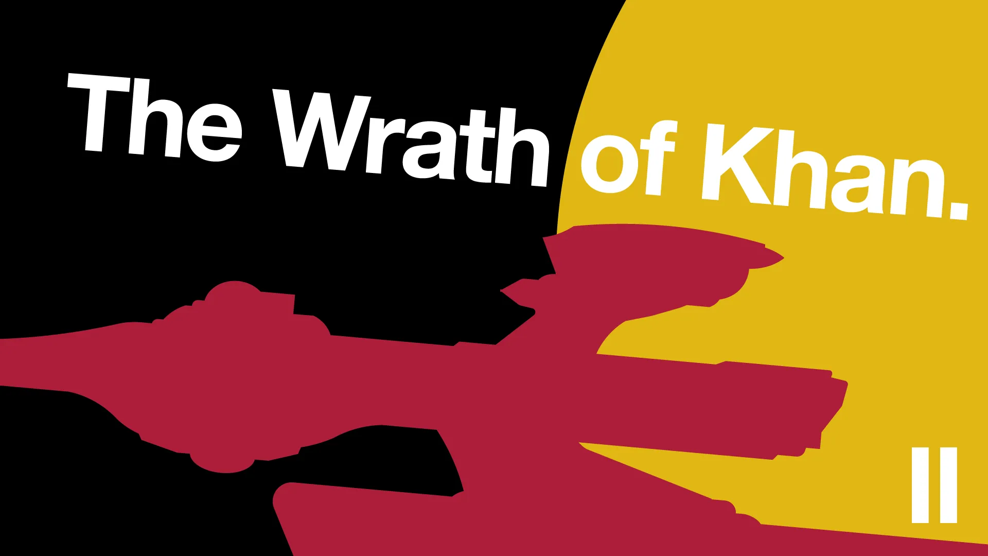
Probably many people’s favourite, The Wrath of Khan. One thing I didn’t want to do in this series was use the same starship twice. TWOK features Kirk and crew (well, not Chekov, to be pedantic) still serving on the refit Constitution-class from the previous film, so the honour here instead lands on the Miranda-class USS Reliant that Khan and the Augments hijack. The colour and composition here are rather intentional, with the Reliant shown flying away from the yellow planet, just as Khan uses it to escape from the desert planet Ceti Alpha V.

The ending of The Wrath of Khan ends in the creation of Genesis, a newly terraformed planet that is lush, verdant and very, very blue. In The Search for Spock, the Enterprise crew are trying to get back to it after learning that Spock (who died) isn’t actually dead (surprise!), and his miraculously infantilised body is back on Genesis just waiting for them to come and pick him up. Unfortunately for them, Christopher Lloyd is piloting a Klingon bird-of-prey and is determined to get in their way. The Enterprise goes bang, and Kirk and company end up stealing the bird-of-prey for their own uses. Seen here, the bird-of-prey orbiting the (still) very blue Genesis.

The Voyage Home is a very fun film. It’s also one that perhaps afforded the most compromise in this project. Set on Earth in the 1980s, there are ultimately only two spacefaring vessels that get more than a few seconds of screen time in this flick. Two. And one of them is the same bird-of-prey as The Search for Spock. The honour thus falls to the Whale Probe. Yup. The Whale Probe. If you’ve never seen The Voyage Home, you’ll know that the Whale Probe is literally an unornamented cylinder with a hovering ball that likes to scream a lot. It is basically the least interesting or complex ship design imaginable. Good job, Whale Probe.

Star Trek V: The One Where They Kill God, known to some as The Final Frontier, is not considered a good film. Part of the central premise of the film directly contradicts later canon in the Trek universe. It randomly reveals that Spock has a half-brother he’s never mentioned (which seems to be a running theme, going by Star Trek: Discovery). It’s generally not very good. Still, the newly minted Enterprise-A gets her first rodeo here, so she takes pride of place in the thumbnail, alternately seen to be sailing to the centre of the galaxy, or otherwise with an angelic halo surrounding it. After all, is a ship that can kill a god not a god in itself?

Fun fact: The Undiscovered Country was originally going to be the title for The Wrath of Khan, wherein the eponymous “undiscovered country” was death. Here, it represents an unknowable future brought about by the signing of the Khitomer Accords, finally signalling lasting peace between the Federation and the Klingon Empire. Of course, not everyone approves of peace, so the Enterprise crew has to save the day from saboteurs, whilst accused of themselves being the saboteurs.
This thumbnail hosts the Excelsior-class USS Excelsior. Although the Excelsior had already made appearances in the previous three films, here it finally takes centre-stage commanded by Captain Sulu, and effectively plays the role of a second hero ship alongside the Enterprise, affording it the honour of a thumbnail.

The Next Generation era of films appropriately started with Generations—the passing-the-baton crossover entry between the original series and its successor. It is also the only Star Trek film to feature the television series’ iconic Galaxy-class USS Enterprise-D, so of course, that takes pride of place here. One of the most unique features of this class of ship, I think, is the forward sweeping (and really quite stubby) warp nacelles, which is why I opted to focus on those in the thumbnail. It is backed by The Nexus, a wobbly ribbon of space energy that facilitates the team-up of Kirk and Picard against a rather annoyed Malcolm McDowell.

The Big D ultimately fell victim to production values. The filming model just didn’t stand up to the higher resolutions of cinema cameras, and the ship being so wide and dumpy was apparently “uncool” or something. First Contact sees the introduction of the much slimmer, sleeker, and incredibly long Sovereign-class Enterprise-E.
But that’s not what’s in the thumbnail. The Borg are attacking Earth (and believe me, I was tempted to just draw a square, call it a Borg cube and be done), and most nefariously, they’re doing it in the past! The Enterprise crew must travel back to a more primitive time—the 21st Century—to stop the Borg from preventing the first contact between humans and aliens, and let the first warp-speed spaceflight proceed as history demands. It is that ship, Zephram Cochrane’s Phoenix that takes pride of place in the thumbnail, just as it has various desk models and Star Trek: Enterprise opening titles throughout Star Trek canon, leaving our blue planet for the reaches of space for the first time.

Insurrection, aside from being a word that now mainly reminds me of the sixth of January, is an OK film. Not great, not terrible, just like this thumbnail. The Enterprise-E finally gets to show up, selected over various Son’a ships that appear in the film just because they’re all pretty unmemorable. (I literally couldn’t remember any of them. They’re that bad.) Also present in Insurrection is the Federation holoship, which is interesting in concept, but visually is only marginally more interesting than a Borg cube. The Enterprise is here in red, representing Picard’s renunciation of Starfleet’s actions during the course of this film and the Enterprise subsequently going rogue, hailing back to the hijacked Miranda-class in The Wrath of Khan’s thumbnail.

Ahh, Nemesis. The film that killed the Trek film franchise and—if rumours are to be believed—almost took Tom Hardy’s acting career with it. Suffice it to say, many probably consider this to be the worst of the original film run. Hardy plays Shinzon, Picard’s age-accelerated clone, the result of an abandoned Romulan plot to sneakily replace prominent Starfleet officers, who has since been left to toil in slave labour on Remus. He gets mad, assassinates the entire Romulan senate, announces himself as the new leader of their society (whut) and builds the Scimitar, a ship so massively overpowered that it has three-times the armament of the Enterprise even before you include the giant radioactive laser beam that can disintegrate thousands of people at once following the just-long-enough-to-create-tension charging sequence.
Nemesis is very green. The radiation weapon is green. The nebula where the final big ship battle happens is green. The film’s poster is green. The Scimitar isn’t green, but it might as well be. It takes the thumbnail.
So that’s my thumbnails. They could probably use some refinement, and I definitely got more adept at vectoring the ship outlines as they went on, but for now, I’m happy with them.