Today, the Government Digital Service (GDS to its friends) is launching the refreshed GOV.UK brand.
The likes of Reddit and tabloid news outlets picked up on this a few days ago, but this shouldn’t really be news. In fact, the initiative to update the brand was announced well over a year ago, including the reasons for it happening, and that the costs for it would be taken from GDS’s normal operating budget.
Still, it’s now news, and I think a lot of people have questions about it that probably won’t get answered in the official press release, so I wanna put down some thoughts on it. But first…

Any views expressed here are entirely my own and do not represent my employer or colleagues. This blog post has not been authorised by or reviewed by anyone at my employer.
Let’s get underway, shall we?
Wait, who are you?
Hi, I’m beeps! This is my website.
I’m a frontend developer on the GOV.UK Design System team, where I’ve been involved in quite a few neat projects like making components localisable, building the Exit this Page component, and launching King Charles III’s Tudor Crown. I like to code, but I also have a bit of background in design.
Most pertinently, I’ve been involved in the GOV.UK brand refresh work since September, initially as a ‘consulting developer’ (to maximise the Sherlock Holmes vibes) advising on the feasibility of the concepts being presented, and later as one of the team prototyping and implementing those concepts.
I’ve had my fingers in this pie for a while.
Why change, and why now
The GOV.UK website has been around for 13 years now, and it hasn’t really changed all that much—it’s been a mostly black-and-white website with a crown and a wordmark for all that time. What has changed is everything around the website.
Generations that have lived their entire lives with the Internet available to them have come of age, bringing with them a melting pot of… stuff. A lot of them are technically savvy and expect digital services to integrate better with their expectations. Many of them are politically disconnected or disenfranchised and will avoid interacting with the government unless it’s completely necessary.
Our user research found that many of them see GOV.UK as something monolithic, unfriendly, and even intimidating.
Alongside them, smartphones and wearable devices have become far more ubiquitous, as have apps and the capabilities available to them. You can have your ID on your phone, have a live activity giving you real-time updates on something, and digital assistants can plug into app intents and do things on your behalf.
GOV.UK was only ever designed to be a website. A place where you come if you need information or to do a specific task, and then don’t visit until you need more information or to do a specific task again. Because of that limited scope, the GOV.UK brand never really had a reason to be more than a logo and a typeface.
The two overarching motivations behind the brand refresh are:
- To expand the GOV.UK brand to provide flexibility across multiple platforms, such as apps, video, and social media.
- To tackle the perception among younger generations that GOV.UK looks unfriendly and intimidating, without devaluing the existing trust in the service.
This doesn’t mean the website is being left behind. It’s a well-established rule that a good service should meet users where they are, and today that’s on platforms, not websites. GOV.UK wants to put more emphasis on effectively advertising itself on those platforms, but the end result is still that the bulk of information and services are web-based.

Opinion zone: I personally don’t find the second motivation to be a particularly solid one. I don’t expect government services to be friendly and bright. In a way, I don’t particularly want them to be.
Still, based on the user research findings, I understand why things have swung in the direction they have.
It’s a refresh, not a rebrand
We’ve been keen to emphasise that this isn’t a rebrand, and it was never intended to be. GOV.UK has a pretty great reputation as far as government services go, and we don’t want that to change. This work is intended to be an evolution and expansion of what already exists, not tearing down and starting over.
There’s a lot more that has changed than just the logo. The updated brand encompasses a massively expanded colour palette, animation and visual assets, and a design language that is intended to be shared across a number of platforms, many of which will not see the light of day for a while. Today’s launch is just square one of a process that’s going to continue for many more months.
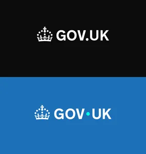
We’re blue now
And we always were. Heck, the GOV.UK homepage has been majority blue since November 2023. The blue used on the refreshed brand is exactly the same one that has been used on GOV.UK for several years; we’re just leaning into it more.
Contrary to some commentators’ beliefs, it’s not meant to represent the Conservative Party. Blue, in western colour theory, evokes feelings of trust, safety, and stability, which is why it’s rather a useful colour to have on government services.
The cyan (it’s not teal) dot is also not a reference to a political party of any stripe, but instead half a reference to GDS’s new parent organisation, the Department for Science, Innovation and Technology (whose colour in the Government Identity System is cyan) and half a ‘poppy’ accent to the brand blue. All of the colours in the new palette have an equivalent ‘poppy’ version; this just happens to be the blue one.

I hate that I used the word ‘poppy’ to describe a bright colour… twice.
Opinion zone: I don’t care for the cyan. It’s too oversaturated for my liking.
Hello, Dot
The raising of the gov-dot-UK dot into an element separate from the wordmark, has similarly raised some eyebrows. I call her Dot. (This is literally just me—it’s not an official thing.)
The first reason was simply to make the wordmark look less like a web address, as people will now be seeing content from and interacting with GOV.UK services in places that aren’t the GOV.UK website.
The bigger reason was to create a new visual leitmotif that can be used across mediums. Dot is going to appear in contexts detached from the rest of the logo much more in future, such as in motion graphics and user interface elements. Having Dot gives us a flexible, consistent element to play with.

For the curious, the way to write GOV.UK in prose remains the same. It’s not GOV · UK.
Oh, and about the cost
A bit of hubbub has been made about the cost of the brand refresh, lamenting that a chunk of change (about half a million) was given to an agency to ‘only’ change a colour and move Dot.
This perspective only focuses on the logo, and completely ignores the other additions to the brand that are being introduced over time. It ignores that everything was tested, prototyped, refined, and tested again dozens of times with members of the public. It might not be obvious from a single side-by-side graphic, but a lot of time went into interrogating what we had and experimenting with what could be added.
It was the full-time salaried efforts of dozens of design, development, and delivery specialists for more than a year. By that metric, it’s actually quite cheap.
The place we landed was well-considered and intentional. Just because the destination of that journey was a logo that intentionally looks quite similar to the existing one doesn’t mean that the money was wasted, or that creating something radically different would have been better value for money.
A holiday isn’t a waste of money just because you return home at the end of it.

And hey, we could’ve spent £100,000 on utter dogshit instead.
What’s to come
All of this work is out in the open. You can read the brand guidelines yourself, you can download and play with the assets as you please.
As mentioned before, today is just square one of what’s to come.
On the website, it may not seem like much has changed, but this is literally the MVP of the refreshed brand elements, and it’s going to take a bit of time for what’s new to bubble through to 13 years of existing stuff.
Changes on social media will probably happen quite quickly, by comparison, and the GOV.UK App and GOV.UK Wallet will be launching with the new look as well.
And this doesn’t mean we’re going to be stuck with this logo and this colour scheme for the next 13 years either. Nothing is fixed; everything is fluid. Maybe one day we’ll tweak the hues or lower the saturation of Dot, but that isn’t today.
And so I ponder
I don’t live in some civil service bubble. I understand why this might be controversial, and I raised those concerns during the process.
Despite my reservations, I am pretty proud of having worked on this. It’s kind of a big deal, maybe the biggest deal I’ll be involved with in my entire professional career, and I’ve done my level best to make it a reality.

And believe me, as the ‘consulting developer’, I helped avoid so many worse ideas from happening.
And that’s been true of pretty much everyone involved. Everyone has done great work against limited time, limited resources, and tireless pressure—many of us while also doing our usual work—against a backdrop of reorganisation within GDS that also added daily stress.
I fully expect it to evolve in the future, and in the near term, I’m probably going to remain part of that evolution. I’m excited to see how it goes!