Over the years I’ve developed a fairly complex self-identity, one that I’ve written about extensively over the last couple of months.
You’re probably tired of all that by now, so let’s have some fun with it instead. One of my random side-interests is vexilollogy—the study of flags, their designs, symbolism, and history—and where there are identities, there are flags.
Pride flags aren’t governed by any central entity. There is usually more than one flag representing any one identity, variants upon those flags, disagreement over which is the best or most inclusive, and all sorts of similar discourse. What can I say? Folks want a flag they can relate to! These are only the flags that I personally use.
And on that note: These are my opinions! I’m gonna dunk on some of these designs for fun, but that doesn’t mean the creators are big weenies who should never try making a flag ever again. Many of them are well established and loved by many, and I don’t actually hate any of them—they’re the flags that I use, after all!
With that out of the way, let’s rate them, shall we?
Progress pride flag
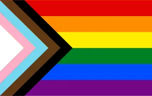
Background: Designed by Daniel Quasar in 2018, the progress pride flag is intended to highlight areas where LGBTQIA+ rights are still lacking—namely the areas of transgender rights and the rights of people of colour. These areas are in need of ‘progress’ and are represented in the form of a right-pointing arrowhead, overlaid on the historically more common six-stripe rainbow pride flag.
The progress pride flag is derivative of the transgender pride flag (more on that below), and the 2017 Philadelphia pride flag (created by marketing firm Tierney), a variant on the six-stripe rainbow pride flag that became common in 1979, which is itself a variant of the original eight-stripe version designed by Gilbert Baker the year previous.
In 2021, Valentino Vecchietti created the intersex-inclusive progress pride flag, which adds the intersex pride flag to the arrowhead.
Thoughts: A lot of people don’t like the progress pride flag. ‘Too many colours’, they claim; ‘the original was already inclusive’, they say. I disagree. I like the progress pride flag. I like the symbolism backing its creation. I think the arrowhead element adds some visual interest to what would otherwise just be horizontal stripes.
Yes, there are a lot of colours going on here—most of them heavily saturated—and I would probably prefer the colours to be more mellow. I quite like what Apple has done in this area when creating their annual Apple Watch pride faces, using paler, but still quite bold, shades of the main colours, but overall, I think the progress pride flag and the intersex-inclusive revision that followed are both pretty great at what they set out to do.
Rating: 9 out of 10.
Transgender pride flag
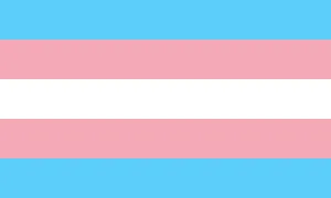
Background: The transgender pride flag was designed by Monica Helms in 1999. The two blue stripes represent masculinity, the two pink stripes represent femininity, and the central white stripe represents non-binary gender identities and the transition between binary genders.
Thoughts: I think this flag is… fine. It’s certainly become very widely recognised and I think that is largely due to its simplicity in design, colour choice, and symbolism; but it is those aspects that I also find to be most passé about it.
Pride flags that are simply stripes with no additional adornment are boring. There, I said it. A lot of pride flags follow this formula, their designs based on the stripes of the Baker rainbow flag, but the Baker flag was emulating a real thing: a rainbow, a linear pattern of horizontal stripes. Other pride flags never needed to follow this pattern and I kind of lament that they did.
The colours are… definitely heteronormative. Pink is for girls, and blue is for boys. Great job breaking down gender norms with that one. Why the stripes are arranged in the way they are kind of confuses me too. If white is the ‘transition’ between blue and pink, why are the blue and pink stripes placed directly next to each other? Why isn’t this a three-stripe flag? The mind boggles.
Rating: 5 out of 10.
Agender pride flag
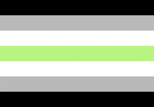
Background: The agender pride flag was designed by Salem X in 2014. The black and white stripes represent an absence of gender, the grey stripes represent people who are semi-genderless, and the green stripe represents non-binary gender identities. It’s green because green is the inverse to purple (which is what you get if you combine blue and pink—male and female).
Thoughts: Oh boy, another horizontal stripe affair with the same colours repeated multiple times.
To be honest, I dislike this one more than the trans flag. There are even more stripes and even more unnecessarily repeated colours. The symbolism of each colour also seems somewhat contrived, as though the flag wasn’t originally designed with them in mind—like why do black and white represent the same thing?
You could lop off the top or bottom three stripes and this would be a better flag for it.
Rating: 3 out of 10.
Panromantic pride flag
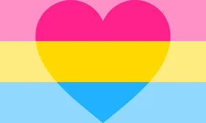
Background: The creator of the panromantic pride flag is unknown, but suffice to say it’s largely derivative of the pansexual pride flag created by Jasper “shrikeabyssals” in 2010 so that pansexuals had a flag distinct from the bisexual pride flag.
Jasper freely admits that they designed the flag with aesthetics as the priority, which I think they achieved well. Blue and pink once again represent male and female gender identities, but this time yellow takes the stage for non-binary genders, chosen for being a colour uncommon to other pride flags and to also represent “life and happiness”.
The panromantic pride flag iterates on this by adding a heart to it, to represent romanticism.
Thoughts: This is where it gets a little controversial, but I think this flag is OK. Kinda. Literally 100% of what I find positive about it is because of the pansexual pride flag—which despite conforming to the same design and gender norms as the flags I’ve already covered—is at least simple in execution and bold in its use of complementary colours.
The heart is way, way too big, and it being a semi-transparent overlay across the entirety of the flag means this commits one of the gravest flag sins: being something stupidly difficult to actually make in real life using actual textiles. Okay, sure, with modern flag printing techniques it doesn’t really matter, but if this flag were to be produced old school, with dyed fabrics being cut up and stitched together, this flag would be a real pain in the ass to do.
To be fair, the panromantic pride flag is not the only flag to commit this crime. Various other romantic pride flags follow the exact same formula of slapping a heart over the -sexual version of the same flag. Some do it better than others, but this panromantic flag is probably one of the worst offenders.
Rating: 6 out of 10; but that’s entirely because of the pansexual flag.
Asexual pride flag
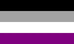
Background: The asexual pride flag was the result of a flag design competition organised by the Asexual Visibility & Education Network (AVEN) in 2010, which was won by the user “Standup”. The black, grey and white bars represent the asexual spectrum—black being entirely asexual people, grey representing graysexuals and demisexuals, and white representing non-asexual people, also called allosexuals. The purple stripe represents community.
All of these colours were derived from the pre-existing asexuality triangle that was used by AVEN. The use of purple was likely a result of it being AVEN’s brand colour.
Thoughts: For a flag that is, arguably, quite corporate in origin, I think the asexual pride flag is pretty great!
I also think my opinion on it is entirely biased! Grey and purple are my colours! Unless you’re in dark mode, the design of this website probably attests to that. (For reference if you’re in the past, future, or just can’t see my website: It’s a lot of black, grey, white and purple.)
The symbolism of the flag is fine. It loses points, once again, for being a boring old set of unadorned horizontal stripes. I’m also not entirely down with a flag representing asexuality having one-quarter of its surface representing allosexual people, but I’m not sure how else the gradient metaphor could have easily been translated, so I’ll give it a pass.
Rating: 7 out of 10.
Non-human unity flag
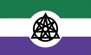
Background: The non-human unity flag was designed by “cladotherian” in 2020. It incorporates existing symbolism from the therian and otherkin communities.
According to the creator, the green stripe represents therians, the purple stripe represents otherkin, and the central white stripe represents other non-human identities. The symbol in the centre is a combination of the Greek letters theta and delta (Θ and Δ) and a septagram—a seven pointed star also known as the “Elven Star”—which historically represent therian and otherkin, respectively.
Thoughts: I dig this one too! Whilst I’m not sure whether the symbolism of the green and purple stripes has any precedent in their respective communities (I couldn’t find any), they’re pleasingly complementary.
Appropriately, though I assume coincidentally, they’re the same colours used by other ‘umbrellas’ like the genderqueer pride flag—which encompasses all non-cis gender identities, voidpunk flag—a subculture for people who feel disconnected from humanity, and the brand colours of Alt+H—an advocacy group for people with non-human identities.
The central symbol suffers from being too complex to either scale nicely or be easy to reproduce. A new symbol that implied the source symbology, rather than incorporating it directly, may have worked better in this context. Still, the current symbol makes sense within the context of the flag so I can’t judge too harshly.
Rating: 8 out of 10.
Robotkin flag
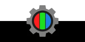
Background: The robotkin flag was created by 0×9E01 in 2021. The black and white background represents binary, the basic building blocks of software—a robot’s mind. The grey gear represents mechanical hardware—a robot’s body. The red, green and blue segments represent RGB display technology—a robot’s primary means of expression.
Thoughts: Full disclosure: I’m acquainted with the creator of this flag and it has previously permitted me to make merchandise incorporating it.
This flag is, in my opinion, pretty much perfect. Every part of it is symbolic, the design is considered and well-proportioned, it’s simple enough to reproduce in small sizes, and—unlike a lot of flags we’ve looked at today—it’s not boring.
The only fault this flag has, if any, is that the RGB colours don’t reproduce well in print, but really, which self-respecting robot is going to be printing things?
Rating: 10 out of 10.