The second in my mini series about web form design. See part one, which focused on the kinds of questions you ask if you haven’t already. This post is going to cover some bits about how you lay out those questions.
Make inputs look like inputs
This sounds like an obvious one, but once you start looking you might be surprised how often you find websites where a text input doesn’t look like a text input or a radio button doesn’t look like a radio button.
This was probably at least somewhat influenced by the early versions of Google’s Material Design, which designed text inputs with… underlines?
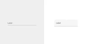
This does not look like an input; it looks like a line. Where do I click to focus it—on the text? But that’s not how labels for inputs normally work. Maybe the input is below the line?
Even with their attempts to right the ship in Material Design 2 by adding a background colour, this is rubbish. If you want people to put something into a box, step one is making it look like a box!
Material 2 at least provided the option of an ‘outlined’ version of their component, which better aligns with more traditional text input designs, which Material 3 has retained.

Some of the more techy among you might be thinking that this is all very “appealing to the lowest common denominator”, that only a fraction of the population would be so unfamiliar with technology as to not recognise a form input just because it looks a bit different.
Yeah, nah. A lot more people than you probably expect, with much more technical experience than you probably think, struggle to use interfaces that look different to what they’re used to.
Bad design excludes people of all backgrounds. Good design is for everybody.
And make sure they’re contrast-y too
A simple one.
Lots of people know about the minimum 4.5:1 contrast ratio that text should have to meet the Web Content Accessibility Guidelines’ Level AA, but fewer seem to be aware of the minimum 3:1 contrast that user interface components, like buttons and form controls, should have.
Doing so makes sure that your form inputs can be seen clearly by those with a variety of eyesight issues, including vision loss, cataracts, colour vision deficiency, or even just screen glare on a sunny day.
Don’t use placeholder text or floating labels
Sorry, Google, but Material Design got this wrong too.
When people fill out forms, they tend to do so in two cognitive phases: providing and reviewing. These phases happen in sequence. They will fill out the form, go back and review what answers they’ve given, and then submit it.
The style of text input where the label appears to be inside the input totally fucks with this, because empty inputs don’t look empty. A missed question cannot be caught so easily ahead of time, so users end up getting unexpected validation errors.
Placeholder text suffers from the same issue of making unpopulated fields look populated, in addition to not being particularly accessible thanks to insufficient contrast (at least by most browsers’ defaults) and not being consistently announced by screen readers.

There are a few exceptions to this, the primary among them being ‘compact’ examples such as sign-in and search forms.
Users don’t tend to go through the same providing and reviewing phases, and their usual placement in space-limited parts of a page means that using floating or placeholder-style labels is often necessary. They should still have actual
<label>elements in your code though; just make sure you’re inclusively hiding them.
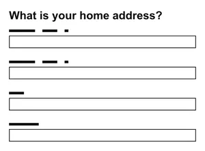
Size inputs according to their expected answers
Look at this form. Can you tell what piece of information goes in each field?
Okay. How about now?
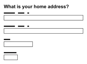
Chances are it was the second image that made it clear that it’s asking for two lines of your street address, your town or city, and your postal code.
Even without labels, the shape of a form helps a user parse what kind of information it’s asking for.
Sizing your inputs according to the answers you expect is an easy, sometimes overlooked, way to help users understand what answers they need to give.
Use a single column
Another simple one: don’t put questions in multiple columns.
Users in the review phase will find it easier to scan the form’s contents if they can read from the top-left and move straight downwards. Adding another column forces the eye to jump around more erratically, either zigzagging left and right or from the bottom of one column to the top of the next.
Users of screen magnification software may also miss inputs that are placed next to others, expecting them to be on the left, aligned with the start of content.

Suffice to say, the top-left and left-aligned aspects of this are specific to left-to-right writing systems. It’d be top-right in right-to-left languages.
Ask one question per page
One thing per page—the notion that a page should only concern itself with one thing, or one question, in the context of forms—is one of the foundational design opinions in GOV.UK-land, and that’s because it works really well.
It prevents users feeling overwhelmed by breaking long pages down into bite-sized chunks.
It allows questions that require more detailed guidance to have the space they need.
It makes pages load faster.
It simplifies development for error validation, creating branching routes if some questions are conditional upon others, looping if more than one answer can be provided for a given question, and allows users the option to save their place and return later.
Speaking of which…
Repeat information back for review and amendment
If a form is quite long, or if a user has resumed from a previously saved state, there’s a decent chance that they won’t remember all of the answers they’ve given.
It’s useful to play back the answers they’ve provided prior to the final form submission and give them a chance to amend anything that’s incorrect; be that due to previously unnoticed errors or a change in circumstances.
And that’s it for this one, I think! I probably missed out some things along the way, perhaps I’ll do a follow up if I remember them.
Join me next time for hot tips ‘n’ tricks on developing forms, right here on the beeps.website.