Evie On-line accessibility audit
This is a brief overview of accessibility issues that I identified with the ewie.online [sic] website on 26th September 2025.
This is a follow-up to a more ad-hoc conversation that took place on 2nd September which identified some a small number of accessibility failures. These have since been rectified.
About this report
Issues were identified using a combination of automated and manual tests using common web browsers and assistive technologies (AT).
The audit is not intended to be completely thorough or authoritative, and by nature is limited by time and resources. It is here as a starter guide to issues that exist and improvements that could be made.
The issues listed are mapped to version 2.2 of the Web Content Accessibility Guidelines (WCAG), a set of accessibility criteria curated by the Web Accessibility Initiative (WAI) at the W3C. WCAG criteria are split into three ‘levels’ of compliance:
- Level A: Considered to be the bare minimum necessary for accessibility compliance.
- Level AA: An ‘acceptable’ level of compliance. This level is specifically referenced by various governments (including those of the US and UK) as their baseline for compliance with equality legislation.
- Level AAA: Maximum compliance. This is generally only considered necessary for services that explicitly cater to disabled and special needs individuals, though some aspects of Level AAA are fairly easy to achieve and provide wider benefits.
Each higher level must additionally meet all criteria of the previous level to be considered passing.
Today, I primarily checked for compliance against levels A and AA. This doesn’t mean that the website wouldn’t benefit from also incorporating aspects of level AAA, just that I did not consider the majority of level AAA criteria in the audit process.
It’s important to note that WCAG is a set of guidelines. There may be situations where technical limitations or the nature of how something is intended to work makes it impossible to make accessible. In these situations it’s recommended to list these as known issues in an accessibility statement on your website.
Finally, I ask that you please take this report in the constructive manner it’s intended in. I’m not attempting to discredit the website or yourself. Websites of all scales and resources can do things wrong sometimes. I also don’t expect anything to be fixed in any sort of timeframe, so don’t worry about it.
If you have any further comments or questions about the content of this report, feel free to contact me through whatever means you prefer. I’m happy to try and help rectify any of the issues identified here.
Recommendations to meet WCAG
These are issues that appear to directly violate one or more of the WCAG Level A or AA criteria.
Add meaningful titles to pages
Many pages currently lack unique or descriptive titles, with several pages being titled as ‘Evie On-line’.
Unique page titles helps all users to understand where they are on the website, and to know which pages are available if they have multiple tabs open.
This would be particularly beneficial to voice control users, who will need to refer to tabs by name, and screen reader users, who will otherwise have to navigate through the content of each page before understanding if the page is the one they were intending to navigate to.
Related WCAG criterion: 2.4.2 Page Titled (Level A)
Add an accessible label to the website logo
The website logo link (with the class name home-link) does not have a text alternative associated to it, rendering it invisible to assistive technologies.
There are multiple ways you could resolve this issue:
- Add inclusively hidden text within the link.
- Add an
aria-labelattribute to the link or SVG. - Add an
aria-labelledbyattribute to the link or SVG, which connects to theidof an element containing the accessible label. - Add a
titleattribute to the link.
Related WCAG criteria:
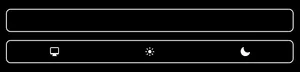
Add focus styles to theme and colour scheme switches
The theme and colour scheme switches on the menu page lack focus styles when navigating by keyboard.
These styles are necessary so that users who navigate using a keyboard (or other cursorless hardware) know where they’re currently located on the page.
You may want to read 2.4.13 Focus Appearance (Level AAA) for guidance on creating an accessible focus state, but meeting the requirements of that criterion isn’t necessary for Level AA, you just need some sort of visible indicator.
Related WCAG criterion: 2.4.7 Focus Visible (Level AA)
Increase the contrast of the search ‘load more results’ button
The ‘load more results’ button that appears below search results lacks sufficient text contrast to be accessible.
Currently, the text is #808080 and button background is #fcfcfc, creating a contrast ratio of 3.83:1. The size of this text is the equivalent of 12 points.
To meet WCAG, text below 18 points in size must have a minimum contrast ratio of 4.5:1. To rectify this, either:
- Darken the colour of the text within the button until there’s a 4.5:1 minimum contrast ratio.
- Increase the size of the button text to 18 points (equivalent to 24 pixels) or larger.
The same grey on the border of the button is already sufficiently contrasting to meet 1.4.11 Non-text Contrast (Level AA), so doesn’t need changing.
Related WCAG criterion: 1.4.3 Contrast (Minimum) (Level AA)
Ensure that non-text content has meaningful alternative text
This is a bit more piecemeal, but I noticed that whilst most images have alt text defined, some of them lack alternate text that accurately describes the content of the image. To pull a few examples:
- The images in these posts lack alternate text: 1, 2, 3
- The images in these posts have alternate text including the speech in the image, but do not describe the rest of the image: 1, 2
- The images in this post appear to have humorous observations about the image for alt text, instead of describing the images: 1
I didn’t trawl through every blog post, so there may be other cases not listed above.
Related WCAG criterion: 1.1.1 Non-text Content (Level A)
Alternate text also applies to video and audio content, and as such is also lacking from posts containing video. For videos you may want to explore captioning, but for audiovisual content it’s often easiest to provide a transcript alongside the embedded media.
Related WCAG criteria:
- 1.2.1 Audio-only and Video-only (Prerecorded) (Level A)
- 1.2.2 Captions (Prerecorded) (Level A)
- 1.2.3 Audio Description or Media Alternative (Prerecorded) (Level A)
Add borders or outlines to content areas in forced colours mode
Currently, blog posts and sections of a page are separated from one another by use of background colour and drop shadows.
These visual elements are not present when forced colours are enabled, making it harder to distinguish sections from one another.
You can rectify this by adding a transparent border around each section, which will become visible when forced colours mode is active, or using the forced-colors: active media query to add the border explicitly for forced colour users.
@media (forced-colors: active) {
  .shadow-med {
    border: 1px solid;
  }
}
Related WCAG criterion: 1.4.1 Use of Color (Level A)
Colour theme selection is not visible in forced colours mode
The selected states of the accent colour and theme options are not visible in forced colours mode.
Additionally, the accent colour swatches are not visible either.
You could potentially rectify this by adding forced colour-specific styles for the selection state, using the same technique described above.
For the accent colour swatches, you can add forced-color-adjust: none to the previews to override forced colours mode. (In my testing I wasn’t able to make this work due to how you currently set the background-color, however.)
Not sure how handy this all is, given forced colour users cannot make use of the theme options in the first place, but figured I should bring it up as it’s probably a technical fail regardless.
Related WCAG criterion: [1.4.1 Use of Color (Level A)]
Allow the card-frame component to be operated by keyboard
The ‘flipping’ aspect of the card-frame web component (on pages such as this blog post) is not operable by keyboard.
Although I notice that efforts have been made to make this component accessible to screen readers, this does not automatically make it possible to use by a sighted user who uses a keyboard or other cursorless device for page navigation.
Currently, the card element is not focusable by keyboard and there is no obvious operation to ‘flip’ the card over.
Related WCAG criterion: 2.1.1 Keyboard (Level A)
Explicitly mark card-frame images as having no alternate text
The card graphics presented in the card-frame component lack alternate text but are still accessible to screen readers. Unlike other parts of the component, they have not been marked with aria-hidden="true".
You should either mark these images with the same attribute, or alternatively, apply an empty alt attribute, as a text alternate is already provided after the images.
Related WCAG criterion: 1.1.1 Non-text content (Level A)
Advisory changes
These are issues that do not necessarily violate WCAG Level A or AA, but may violate Level AAA, or are considered best practices that can improve overall accessibility.
Don’t have multiple <h1> elements on a page
Pages should only have a single <h1> element that acts as the title for the entire page.
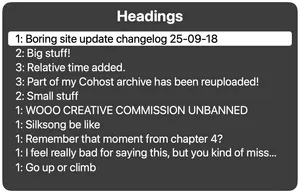
On blog archive pages, the <h1> element is used for the titles of each post. Ideally, the <h1> should be a unique and descriptive heading for the page (such as ‘Post archive, page 3’) and the post headings be <h2> elements, with each subsequent heading ‘knocked down’ a level.
Although WCAG does not strictly require there to be a single <h1>, as the <h1> precedes all other headings on the page in the content hierarchy, it is considered best practice to only have one.
I realise that this is difficult to achieve when emulating a Cohost/Tumblr style post feed and including portions of each post in the archive, however, so I don’t think this is absolutely necessary. It may be beneficial to put the typical <h1> content into the page’s <title> instead.
Related WCAG criterion: 1.3.1 Info and relationships (Level A)
Consider adding visually hidden headings for posts without titles
For posts that lack configured titles, consider adding an inclusively hidden heading that contains some sort of unique identifier, such as the date and time of the post or a snippet of the post’s content.
This makes it easier for screen reader users to get an idea of the page’s structure, as currently these heading-less posts are not visible when navigating the page with certain tools.
Related WCAG criterion: 1.3.1 Info and relationships (Level A)
Don’t include non-operative links or buttons in the interface
The ‘tags’, ‘ask’, ‘about’, and ‘feed’ links in the navigation currently redirect to the homepage, as these sections have not yet been implemented.
Ideally, do not include links to pages that don’t yet exist, as it can confuse users and make them think they’ve made a mistake when navigating.
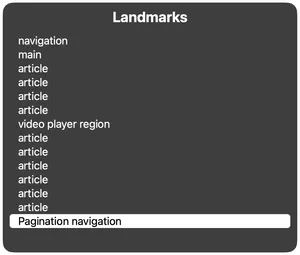
Add labels to navigation landmarks
Post archive pages currently include two <nav> elements, with the potential for a third being added in future.
When there are multiple <nav> elements on a page, it can be difficult for screen reader users to know which one they need to navigate to in order to find the information they want. We can help by giving the <nav> elements accessible labels describing the kind of navigation they are.
For example, the navigation for moving between archive pages could be marked up like this:
<nav class="post-wrapper pagination shadow-med" aria-label="Pagination">
  [...]
</nav>
This label will then be exposed in the landmark navigation tools provided by screen readers.
Use appropriate form input types
A tiny thing: the search form uses <input type="text"> for the search query. This could be <input type="search"> instead, which would enable some user agent features such as search query history and enabling enterkeyhint="search" implicitly.
Consider adding a skip link to bypass repeated page content
Skip links allow assistive technology users to bypass content that is repeated at the top of every page, such as the heading and navigation links, and jump immediately to the main content.
As ewie.online currently only has a minimal header (two links and the logo), I don’t consider this to currently fail the relevant WCAG criterion. However, having a skip link would also not be detrimental.
Related WCAG criterion: 2.4.1 Bypass Blocks (Level A)