Eufuria accessibility audit
This is a brief overview of accessibility issues that I identified with the eufuria.org website on 12th July 2026.
About this report
Issues were identified using a combination of automated and manual tests using common web browsers and assistive technologies (AT).
The audit is not intended to be completely thorough or authoritative. It is here as a starter guide to issues that exist and improvements that could be made.
The issues listed are mapped to version 2.2 of the Web Content Accessibility Guidelines (WCAG), a set of accessibility criteria curated by the Web Accessibility Initiative (WAI) at the W3C. WCAG criteria are split into three ‘levels’ of compliance:
- Level A: Considered to be the bare minimum necessary for accessibility compliance.
- Level AA: An ‘acceptable’ level of compliance. This level is specifically referenced by various governments (including those of the US and UK) as their baseline for compliance with equality legislation.
- Level AAA: Maximum compliance. This is generally only considered necessary for services that explicitly cater to disabled and special needs individuals, though some aspects of Level AAA are fairly easy to achieve and provide wider benefits.
Today, I primarily checked for compliance against levels A and AA. This doesn’t mean that the website wouldn’t benefit from also incorporating aspects of level AAA, just that I did not consider the majority of level AAA criteria in the audit process.
It’s important to note that WCAG is a set of guidelines. There may be situations where technical limitations or the nature of how something is intended to work makes it impossible to make accessible. In these situations it’s recommended to list these as known issues in an accessibility statement.
Finally, I ask that you please take this report in the constructive manner it’s intended in. I’m not attempting to discredit the website or yourself. Websites of all scales and resources can do things wrong sometimes. I also don’t expect anything to be fixed in any sort of timeframe, so don’t worry about it.
If you have any further comments or questions about the content of this report, feel free to contact me through whatever means you prefer. I’m happy to try and help rectify any of the issues identified here.
Other notes
I’ve avoided including externally linked sites in this audit, such as the registration website and Eufuria News Dreamwidth page.
The CORS policy of the Eufuria website prevented some of my automated testing tools from working correctly, so some issues normally flagged by those tools may have gone unnoticed.
Recommendations to meet WCAG
Replace the dropdown menu links with button elements and add ARIA state attributes
The dropdown triggers in the main navigation are marked up as link anchor elements (<a>), reinforced by the addition of role="link" and tabindex=“0” attributes.
<a
  class="_link_91ct1_64"
  role="link"
  tabindex="0"
  aria-label="Events dropdown menu"
  >Events ▾</a
>
However, these controls do not work like links as they do not navigate the user to a new page. Instead, they operate more akin to <button> elements and should probably be marked up as such.
Additionally, the opening and closing of the dropdown is only shown visually. The state of the dropdown is not conveyed to assistive software, so low vision/blind users will not have context of what activating the button has done.
With those in mind, I recommend refactoring this HTML to use this structure instead.
<button
  class="..."
  aria-label="Events dropdown menu"
  type="button"
  id="events-toggle"
  aria-expanded="false"
  aria-controls="events-dropdown"
>
  Events ▾
</button>

<ul class="..." id="events-dropdown">
  ...
</ul>
The aria-expanded attribute should be set to "true" when the menu is visible, and "false" otherwise. (
Also note that aria-expanded exists on the toggle and not the dropdown, so that a user does not need to navigate away from the currently focused element (the toggle) in order to be informed about the dropdown’s status.
Relevant WCAG criteria:
Add a main heading to the homepage
The homepage lacks a top-level (<h1>) heading element.
Webpages are expected to have a <h1> element that acts as a title for the current page. This helps orient users of certain assistive software, such as screen readers.
It doesn’t necessarily have to be a visible heading, though it should be inclusively hidden if it isn’t.
In the case of the homepage at time of writing, the most appropriate top level heading would probably be “Eufuria: The Black Pawrade”.
Relevant WCAG criteria:
Make sure that headings descend sequentially
The ‘Register’ page uses heading levels in a mismatched way. Following the top-level heading (<h1>), each registration type is marked up as an <h4>, prices as <h3>, and heading to perks list as <h4> elements.
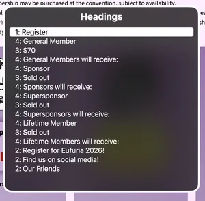
Headings are intended to provide an outline of the page’s structure, starting from the heading that describes the entire page (the <h1>), the major sections of the page (<h2>), subsections of those sections (<h3>), and so on.
Heading levels should always descend sequentially (1 to 2, 2 to 3, etc.). Levels may ascend as needed.
Relevant WCAG criteria:
Avoid using headings for non-heading purposes
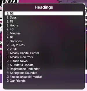
The homepage’s promotional area uses multiple <h2> and <h3> elements to mark up things that aren’t headings, including:
- The days, hours, minutes and seconds in the event countdown.
- The date of the event.
- The venue and location of the event.
The ‘Register’ page additionally uses heading elements for the price of each ticket type.
None of these pieces of information act as headings for subsequent content (they are themselves the content), and should not be marked up as heading elements.
You can see how marking these up as headers creates clutter for the ‘navigate by heading’ mode of a screen reader, with the actual heading structure not beginning until 13 options into the page.
Relevant WCAG criteria:
Markup clickable images with appropriate elements
Clickable images are not marked up in a way that indicates that the images can be interacted with (aka, not as links or buttons).
This means that they do not appear in assistive technology navigation modes and cannot be interacted with using tabbing, though they can be accessed using other forms of keyboard navigation. It may also render these elements inoperable by other assistive technology, such as voice control software.
When accessed using keyboard navigation, the image is described by assistive technology as being clickable, however no keyboard shortcut to emulate a click works.
Wrap the images in <a> or <button> elements and assign click handlers to those elements so that they can be fully interacted with using assistive technology.
Relevant WCAG criteria:
Trap keyboard focus when an image dialog is open
When an image dialog is open, the rest of the page is obscured and rendered inoperable to mouse users.
However this behaviour is not mimicked for keyboard users, who are still freely able to navigate the page’s contents.
When a dialog is opened, the rest of the page should be rendered inert (which can be done using the inert HTML attribute) or the keyboard focus should be restrained to only the elements within the dialog (which can be done with JavaScript).
This one might be a little counterintuitive given
2.1.2
No Keyboard Trap (Level A)
exists, but that criterion is specifically about not placing keyboard users into a situation where they cannot continue. As the dialog has a close button, it does not breach criterion 2.1.2.
Relevant WCAG criteria:
Add text alternatives to icon buttons
A number of buttons that utilise icons lack a text alternative. This prevents screen readers from describing the buttons, and voice control software from using them.
I noticed this issue on:
- The zoom, rotate, download and close buttons in image dialogs.
- The previous day/next day arrows in the schedule grid.
- The close buttons in event dialogs in the schedule.
Add text alternatives either by:
- Adding text content inside of the
<button>(this can be inclusively hidden) - Adding a label using
aria-label - Associating text outside of the button with the button using
aria-labelledby
Relevant WCAG criteria:
Use links with enough contrast on dark backgrounds
The ‘Contact Us’ page includes a list of email addresses within a table. These links have insufficient contrast with the background of the cell to meet minimum contrast guidelines.
The links are #784091 and background is #c69bc6, giving a contrast ratio of 3.02:1. The minimum contrast expected for text content is 4.5:1.
Lighten the colour of these links in order for them to be compliant.
Relevant WCAG criteria:
Provide accessible information about the current state of the schedule and controls
Similar to previous note about the use of ARIA attributes on the main navigation, the current state of the schedule is not communicated to assistive technology users. For example:
- When typing into the search, there is no feedback about how the grid or list has been filtered.
- When filtering by category, there is no feedback on whether the currently focused filter is active or not. When toggled, there is no feedback about how the grid or list has been filtered.
- When changing the schedule view, there is no feedback about which view is currently active.
- When filtering by 18+ events, there is no feedback about how the grid or list has been filtered.
Information about how the grid or list has been filtered can be resolved by having an element that reads back how many events are visible and is dynamically updated when searching or filtering. This could be inclusively hidden if needed.
<div role="status">15 of 42 events visible.</div>
For the category and view schedule toggles, these can be marked up with the aria-pressed attribute to indicate whether the button is currently active or not.
You may want to play around with the labelling to make it clear that aria-pressed="true" refers to that being an active option.
Relevant WCAG criteria:
Advisory thoughts
Hide the column of times on the schedule’s grid view from screen readers
A simple one: the list of times on the grid view only make sense to visual users and introduces a lot of unnecessary noise for screen readers.
You can hide this element from screen readers whilst keeping it visible for others by using the aria-hidden attribute.
<div class="schedule-time-column" aria-hidden="true">...</div>
The times on the list views are okay as they are.
Consider removing the <section> element inside of <nav>
The main navigation uses a <section> element nested within a <nav> element.
Whilst I don’t think this strictly causes any accessibility issues, <section> is intended to be a generic sectioning element (i.e. it conveys no greater semantic purpose) whereas <nav> is a heavily semantic sectioning element.
Having both of these around the main navigation may be a little confusing.
See also:
Consider reducing the line length of text content
Many pages have text content that spans the entire width of the layout (1220 pixels wide at 100% zoom), or about 160 characters long.
Line lines of text make it harder for a reader to ‘reset’ their eyes when they end a line and begin reading the next. This creates visual and cognitive fatigue, which can make it difficult for people to continue reading.
WCAG Level AAA expects a maximum line length of 80 characters for Latin scripts like English. Some other research suggests an optimum line length between 60 and 75 characters.
See:
- 1.4.6 Visual Presentation (Level AAA)
- Readability: The Optimal Line Length by the Baymard Institute.
Consider using more descriptive text for links with repeated text
The homepage’s Eufuria News section displays summaries of articles followed by a ‘Read more’ link to lead to the Dreamwidth blog.
The vendor page also links to vendors websites using terms like ‘Website’ and ‘Instagram’.
However, these links use generic terms and do not describe what they lead to. This creates repeated, ambiguous links when using ‘navigate by links’ mode in assistive technology.
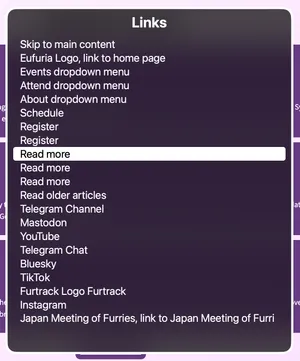
This meets WCAG at Level A, as the links are nested beneath heading elements and are thus considered to be ‘in context’, but it would be more useful to provide more information in the link content.
Note that this issue is only relevant to links with the same text that go to different locations. Links going to the same place are fine to use the same labels.
See:
Consider adjusting alignment of content for screen magnification users
Users with vision issues may use screen magnification software when navigation websites.
This is distinct from zooming, in that the page’s content isn’t reflowed and only a portion of what’s on screen is visible to the user at any one time.
In left-to-right contexts, such as the English language, magnification users will seek to align their virtual magnifying glass at the left of the content area and will move downwards to search for their desired content.
The Eufuria website is sub-optimal for this use case due to the centre alignment of headings and some callout text, and the right alignment of arrows on accordion/disclosure elements.
This alignment makes these features easier to miss by magnification users.
Consider using the scope attribute on tables
Several pages use tables for laying out information. As far as I could tell, all of these uses were sensible situations in which to use a table, so no beef there.
Tables are two-dimensional data structures, and screen readers will usually attempt to read out both the column and row’s heading when navigating to a particular cell.
Whilst these can sometimes be determined through structure alone (such as the use of <thead>), you can help them along by using the scope attribute to define which cells should be announced.
<table>
  <thead>
    <tr>
      <th scope="col">Hours Worked</th>
      <th scope="col">Perk</th>
    </tr>
  </thead>
  <tbody>
    <tr>
      <td scope="row">2 Hours</td>
      <td>Lanyard</td>
    </tr>
    <tr>
      <td scope="row">4 Hours</td>
      <td>Pin Badge</td>
    </tr>
  </tbody>
</table>
I don’t consider this an accessibility issue at the moment due to how simple the tables are, but it may become an issue with larger tables where the current row or column may be harder for a screen reader user to keep track of.
See:
Consider not using emoji as substitutes for graphical icons
Emoji characters are announced by screen readers with their Unicode standard name, which may not convey the same information that a visual user draws from it.
For example, the search field on the schedule is announced as “magnifying glass search for an event” and event runners are announced as “silhouette of person [name]” or “silhouette of two people [names]”.
Having events use the clock emoji closest to their actual start time is very clever though. If a little misleading in the cases of events not starting on or half-past the hour.